
crave pizzeria
Self-initiated brand identity
Brand Strategy · Logo Design · Illustration · Packaging · Print · Merchandise
Overview
Crave is a fictional late-night pizzeria in Soho, New York, built for people who refuse to settle after dark. Whether you’re winding down after a night out or working into the early hours, Crave offers what most late-night food doesn’t: craft, care and a sense of occasion. Come for the best pizza in town, stay for the cocktail-paired desserts.
The challenge
Late-night food usually means fluorescent lights, greasy cardboard and whatever’s still open. I wanted to see if a brand could keep the easy, grab-a-slice energy of a 2 a.m. pizza run while signaling something more considered: wood-fired pies, natural wine, espresso martinis and dessert worth staying for. The identity had to feel playful enough for the after-party crowd and polished enough to justify a gourmet menu.
The concept: a European café that stays up late
I drew from the romance of the Mediterranean bistro: little round tables, curved café chairs, tiled ornament and the slow pleasure of lingering over a meal. Then I turned the volume up. The result is a brand that feels like a seaside trattoria translated into New York nightlife.


Logo and wordmark
The CRAVE wordmark uses a bold, retro display face with sculpted, almost liquid letterforms. In the primary logo, it arches over an illustrated bistro set (two chairs, a table and a small vase of flowers), turning the mark into an invitation to sit down and stay a while. A secondary framed lockup borrows from vintage tile and signage, with floral ornaments anchoring each side. It works at small scales, like a shirt pocket, while still feeling decorative.
Illustration system
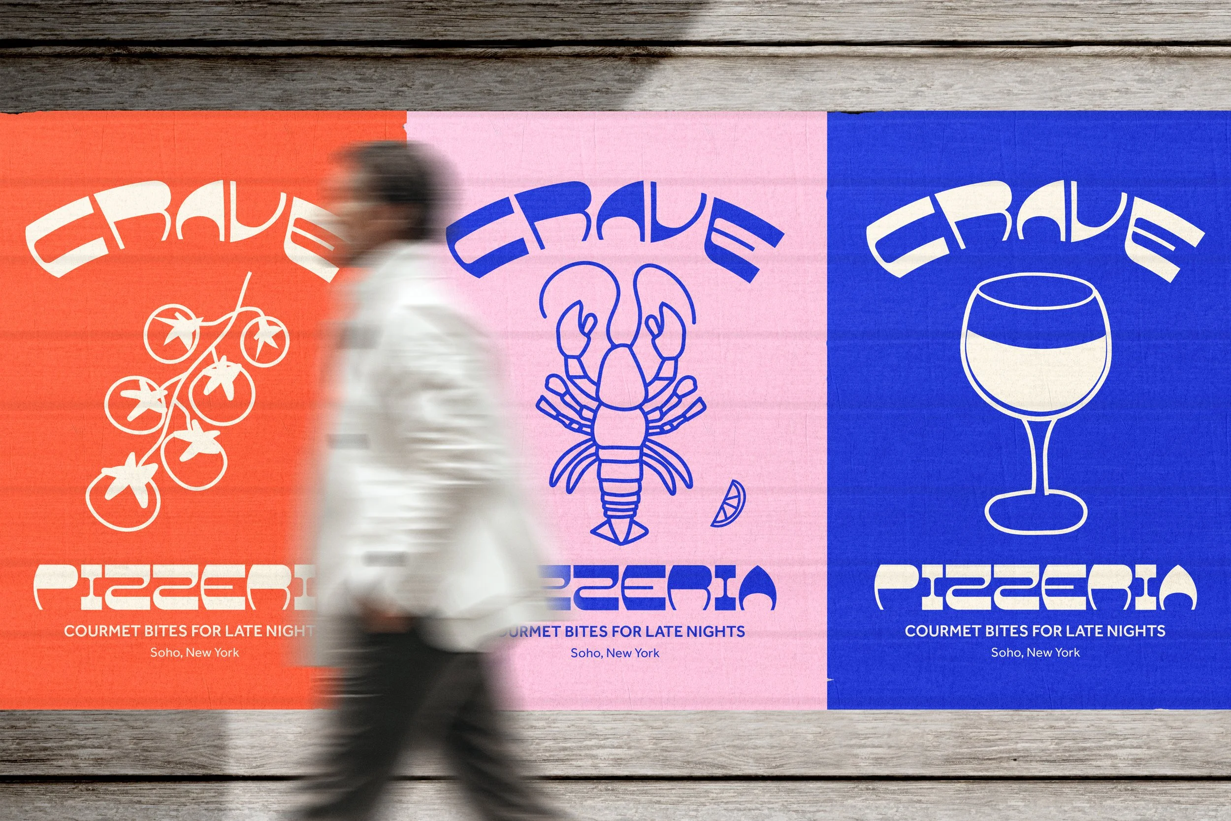
A set of hand-drawn icons carries the menu’s personality: pizza, cherry tomatoes on the vine, a lobster with a lemon wedge, a moka pot, an espresso cup, a wine glass, a martini and a dessert pot with spoon. The icons work individually as hero graphics on posters and napkins, and together as a repeating pattern for wrapping paper and merchandise.
Color
The palette pairs a saturated cobalt blue with soft pink, tomato red and a warm cream. Cobalt brings the nighttime confidence, pink keeps it fun and a little flirty, and tomato red ties everything back to the food. The colors are used in bold, flat combinations so every touchpoint reads instantly, even across a dim room or a busy street.
Typography
The expressive display face is reserved for the name and key moments, while a clean geometric sans handles the tagline and supporting information. The contrast lets the wordmark do the shouting while everything else stays legible and calm.
Applications
I extended the identity across the places a late-night pizzeria actually lives:
Pizza boxes in signature pink, with the tagline on every side so a stack becomes its own billboard
Cocktail napkins featuring single icons framed in a double border, each one a small collectible
Wrapping paper with the full icon pattern under the framed logo
Staff tees with the framed lockup on the front and the full illustrated grid on the back
Wild posters in three colorways, each spotlighting a single icon to tease different parts of the menu